
7 Wall Art Mistakes That Make Rooms Look Cheap — Fixed
Are you staring at a wall that should look great but somehow just… doesn’t?
Three years ago, I bought a canvas print I was certain would transform my living room. It arrived, I hung it, and my wife immediately said it looked like a dentist’s waiting room. She wasn’t wrong. The colors clashed with the couch, the size was wrong for the wall, and the frame looked like it came from a discount bin. I didn’t understand what I’d done wrong until I spent the next several months reading, experimenting, and making more expensive mistakes before anything started clicking.
Here are the seven mistakes I made — and what actually fixed each one.
Why Your Wall Still Looks Empty (Even After Buying Art)
This is the most frustrating problem in home decorating. You spend real money. You hang something. The room still feels unfinished. Nine times out of ten, it comes down to one of three underlying causes — none of which have anything to do with your taste in art.
The Art Is Too Small for the Wall
This trips up almost everyone, including people who consider themselves detail-oriented. The general rule: your art should cover 60–75% of the width of the furniture it hangs above. A 60-inch sofa needs art that spans at least 36 inches wide. Most people buy art that’s half that size, hang it centered, and wonder why the wall looks sparse even with something on it.
A single 24×48 inch canvas almost always works better above a standard sofa than two 18×24 pieces flanking each other. Two smaller pieces rarely achieve the same visual weight — you end up with two separate problems instead of one resolved one. Single large pieces read as intentional. Small pieces read as afterthoughts.
The brands that understand this — Society6, Minted, West Elm — all lead with large-format prints in their catalogs for a reason. Customers who buy large almost never return them. The regret almost always runs the other direction: bought too small, wall still looks empty, back to square one.
The Hanging Height Is Off
Museum standard: center of the artwork at eye level, roughly 57–60 inches from the floor. Above a sofa or bed, the bottom of the art should sit 8–10 inches above the furniture surface. I spent two years hanging everything too high. It creates a visual disconnect between the furniture and the wall — the room reads as two unrelated zones instead of one composed space.
Mark the wall with painter’s tape before drilling. I’ve patched too many unnecessary holes to ever skip this step again.
The Color Doesn’t Connect to Anything Already in the Room
Art doesn’t need to match your furniture exactly, but it needs to connect to something in the room. A gray-toned abstract print might echo the gray in a stone fireplace surround. A blue watercolor piece might reference the throw pillows or curtains. When nothing in the art echoes anything else in the room, it floats. It looks placed rather than considered — like someone hung it there as an afterthought.
The fix is straightforward: pull one or two dominant colors from your existing furniture or textiles before choosing art. Then shop within that palette. It narrows your options significantly, which makes the decision easier, not harder. I’ve seen rooms transformed by one correctly chosen large canvas. And I’ve seen beautiful prints make rooms look worse because they fought everything around them. Color connection matters more than the art’s individual quality.
The Scale Problem Is Almost Always the Culprit
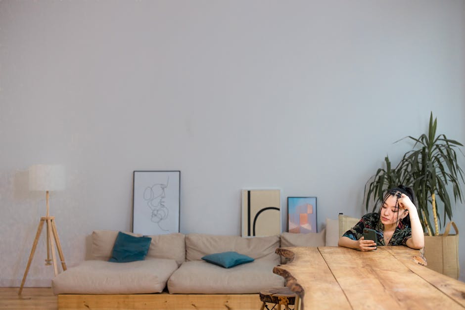
If I had to give one piece of advice, it’s this: buy larger than you think you need. Every time I second-guessed myself and went smaller to save $20, I regretted it within a week of hanging the piece. A 24×48 inch canvas almost always looks better than two 16×20s in the same space. The visual impact isn’t additive — it’s exponential with scale. The mistake comes from wanting to save money. You hang the smaller piece. You spend the next year convincing yourself it looks fine. It doesn’t. The room knows. Buy large.
Gray and Black vs. Blue: Choosing the Right Palette for Your Space
The two most common large canvas art palettes right now are neutral gray-and-black abstracts and blue watercolor prints. They serve completely different rooms. Here’s how they actually compare across the specs that matter:
| Feature | Gray & Black Abstract | Blue Watercolor |
|---|---|---|
| Best room style | Modern, minimalist, industrial | Coastal, bohemian, transitional |
| Works with furniture | White, gray, charcoal, natural wood | Navy, cream, linen, rattan, whitewash |
| Lighting sensitivity | Low — consistent under any light | High — glows in daylight, flat in artificial light |
| Best format | Single large canvas | 3-panel triptych |
| Rental / resale safe | Yes — neutral for any palette | Usually yes, if blue is already in the room |
| Typical price (framed) | $90–$150 | $80–$130 |
Gray and black is the safer default for rentals or rooms you expect to repaint. Neutral palettes don’t fight with new wall colors the way saturated art does. Blue watercolor works beautifully in rooms with significant natural light and warm or coastal elements — linen curtains, rattan furniture, whitewashed wood, sea glass accents.
Gray-walled modern living room with a white sectional? Neutral abstract, no question. Beach house bedroom with a wooden headboard and ocean-colored throws? Blue watercolor is the obvious choice. Pick based on what’s already in the room — not what you find prettiest in the product thumbnail.
How to Measure Your Wall Before Ordering Large Canvas Art

Order the wrong size and you’re dealing with returns, repackaging, and potentially weeks of shipping back and forth. This process takes five minutes and eliminates that entirely.
- Measure the anchor furniture — the sofa, bed headboard, or console table the art will hang above. Write down the exact width in inches.
- Multiply by 0.6 and 0.75 to find your ideal width range. A 60-inch sofa needs art between 36 and 45 inches wide. A 72-inch king headboard needs art between 43 and 54 inches wide.
- Tape the wall. Use painter’s tape to outline your target dimensions directly on the wall. Step back. Live with it for a day. You’ll know immediately if the size works — far better than guessing from a product photo.
- Check ceiling clearance. An 8-foot ceiling above a sofa leaves limited vertical space. If height is constrained, go wider rather than taller — landscape orientation reads better in lower-ceiling rooms.
- Account for frame width. A 24×48 canvas with a 1-inch frame on each side hangs as 26×50. Small difference, but it matters near windows and door trim.
- Locate studs or use rated anchors. Large framed canvas art runs 15–25 pounds. Know your stud locations or use drywall anchors rated for the weight, especially for anything hung above a bed where it could fall on someone.
- Calculate the nail point precisely. Hang the art, pull the wire taut, measure from the top of the frame to where the wire peaks. Subtract that measurement from your desired center height. That’s where the nail goes — first try, every time.
I once skipped step 3 and bought a 36×48 print that looked comically small above a six-foot sectional. Painter’s tape is free. Returning a large framed canvas is not.
What You Actually Get for $99–$110 in Framed Canvas Art
At this price point, framed canvas art has gotten genuinely good. Three years ago I wouldn’t have recommended anything under $200 — thin frames, visible printing pixels, canvas that bowed within a few months. That’s changed. The manufacturing quality in the $100 range has closed the gap on what used to cost twice as much.
The piece I’ve spent the most time with is the 24×48 framed abstract canvas in gray and black, at $109.90. It’s a single-panel large-format print — high-contrast brush strokes across a gray field, the kind of abstract that reads as deliberate from across the room. The black frame is narrow and clean, which is exactly what modern abstract art needs. A chunky ornate frame would destroy this piece. The narrow profile keeps the visual focus on the image.
What surprised me was the canvas tension. On cheaper alternatives I’ve tested from IKEA’s print section and off-brand Amazon listings, the canvas sags or develops a slight bow within months, especially in rooms with seasonal humidity swings. The stretcher bars on this one held. At 24×48 inches, it has enough visual mass to anchor a living room or bedroom wall without needing another piece alongside it.
The 748 reviews and 4.6 out of 5 rating tell part of the story. In home decor — where taste is highly subjective — a 4.6 with that many reviews almost always signals the physical quality is consistent, not just that people liked the color palette.
For coastal, bohemian, or soft-palette bedrooms, the better match is the blue watercolor feather triptych at $99.90. Three framed panels, blue-and-white watercolor feather motif, all ready to hang. It covers significantly more horizontal wall space than a single canvas and works especially well above beds or long buffet consoles where a single vertical piece would feel too narrow. Same 4.6/748 rating — entirely different aesthetic. Both arrive framed. No assembly beyond a nail in the wall.
Questions People Ask Before Buying Canvas Art Online

Will the colors look different in person than on my screen?
Almost always yes, but rarely dramatically. Monitor calibration and screen brightness affect how product photos render. The fix: view the listing on multiple devices — your phone, laptop, and tablet if you have one. If the colors look consistent across all three, you’re getting a reliable preview. Wild variation between devices means the listing photos may not be trustworthy.
For gray-and-black abstracts specifically, this is low-risk. Neutrals shift less under different light sources than saturated colors do. For blue watercolor art, look for buyer photos in the reviews — those are always more accurate than studio shots with controlled lighting rigs.
How long does hanging a large framed canvas actually take?
Single 24×48 canvas: two people, about 15 minutes. One nail or two picture hooks. The tricky part is getting it level — don’t eyeball it. A laser level costs around $20 at any hardware store and makes this foolproof. Drive the nail at a slight downward angle for better holding strength in drywall.
For a three-panel triptych: budget 30–45 minutes. Spacing between panels matters more than most people expect. Standard spacing is 2–4 inches between panels. Too much gap and they read as three unrelated pieces. Too little and the gaps look like a hanging error. Tape all three panels to the wall with painter’s tape first, adjust, then commit to the holes.
Does “ready to hang” actually mean ready to hang?
At this price point, yes. Both pieces include hanging wire pre-strung across the back of the frame — actual braided picture wire, not the cheap sawtooth hangers that strip out of thin frame wood after a few months. All you add is a nail or picture hook. One caveat: always check the listed product weight against the rating on your chosen wall anchor, especially for anything going above a bed or a busy walkway.
My Final Pick for Living Room and Bedroom Walls
For modern or minimalist rooms — gray or white walls, clean-lined furniture, wood or concrete floors — the gray and black abstract canvas at $109.90 is my clear recommendation. Large enough to anchor a wall on its own. Neutral enough to work alongside almost any furniture palette. The frame doesn’t compete with the image. If you want one piece that reads as deliberate — not decorative-by-accident — this is it.
For coastal, bohemian, or bedroom spaces where warmth and softness matter more than edge, the blue watercolor feather triptych at $99.90 is the better fit. The three-panel format covers more horizontal space than a single canvas, the watercolor style brings organic softness that hard-edged abstracts can’t, and the blue palette plays naturally with linen, wood, and natural textiles.
Both are solid choices under $110. Pick based on your room’s existing palette and furniture style first. The art serves the room — not the other way around.